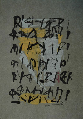
The calligraphy in these works differentiates character from an alphabet. While some readable letterforms might have found place in some of Nitin’s works, the artist seems to willfully negate the system that tells one how to appreciate calligraphy. His project was to inscribe, not to write.
The so-called ‘calligraphic’ strokes in these works evade the system that ascribes function to each single letterform. They do not celebrate an incident or a singular stimulus. They imbibe the persona of a paragraph and yet are not content with being a pragraph. They become schematas, or complex diagram texts that explain what was hitherto unexplained. The inscriptions, thus read, assume the importance of edicts for an experimental mind.
It was the paradox of knowing white and keeping the black that challenged the artist for a compelling sojourn on white papers with black inks. Tea stain washes helped him with the nostalgic, familiar sepia tones but the artist was drawn, over time, to search for white islands from a black sea. The black, as if, was not complete without white….
The engagement with the unreadable does not end here. The questions of primacy of black over white, seen over unseen, island over sea… remain intact. A painting, then, is a window of the vehicle. Your journey continues.
– Abhijeet Tamhane